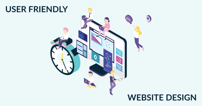
Designing User-Friendly Websites takes center stage, inviting readers into a world of creativity and functionality. Dive into the realm of web design where user experience reigns supreme, promising an exciting journey ahead
In this guide, we’ll explore the essential elements of user-friendly web design, from understanding user behavior to optimizing loading speed and performance. Get ready to create websites that not only look great but also provide a seamless experience for every visitor.
Introduction to Designing User-Friendly Websites

User-friendly websites are those that are easy to navigate, visually appealing, and provide a seamless experience for visitors. These websites are important because they help retain users, increase engagement, and ultimately drive conversions.
Key Elements of User-Friendly Web Design
- Intuitive Navigation: Websites should have clear menus and easy-to-find links to help users move around effortlessly.
- Responsive Design: Ensuring that websites are optimized for different devices and screen sizes is crucial for a positive user experience.
- Fast Loading Speed: Users expect websites to load quickly, so optimizing performance is key.
- Accessible Content: Websites should be designed with all users in mind, including those with disabilities.
- Visual Appeal: Aesthetically pleasing design with a good use of colors, fonts, and images can enhance user engagement.
Examples of User-Friendly Websites
- Google: Known for its simple and clean interface, Google’s search engine is easy to use and navigate.
- Amazon: Amazon’s website has intuitive search functionality, personalized recommendations, and easy checkout process, making it user-friendly.
- Apple: Apple’s website features a minimalist design, clear product information, and easy access to support resources, creating a seamless user experience.
Understanding User Behavior
Understanding user behavior is crucial in website design as it helps in creating a user-friendly experience. By knowing how users interact with websites, designers can tailor the design to meet their needs and preferences.
User research and analysis play a vital role in designing user-friendly websites. Through surveys, interviews, and usability testing, designers can gather valuable insights into how users navigate websites, what features they find useful, and what pain points they encounter.
User Behavior Patterns
- Scrolling Behavior: Users tend to scroll more than click, so placing important information above the fold is essential.
- Click Patterns: Users typically follow an “F” shaped pattern when scanning a webpage, so placing key elements along this path can improve visibility.
- Attention Spans: Users have short attention spans, so designing for quick load times and clear, concise content is crucial.
- Mobile Usage: With the rise of mobile devices, designing for responsive and mobile-friendly websites is key to meeting user expectations.
Visual Design and Layout: Designing User-Friendly Websites
Visual design plays a crucial role in creating a user-friendly website. It involves the use of colors, typography, imagery, and layout to enhance the overall user experience. A well-designed website not only looks visually appealing but also guides users in navigating through the content easily.
Importance of Intuitive Navigation
Intuitive navigation is essential for enhancing user experience. Users should be able to find what they are looking for quickly and easily. Here are some tips to achieve this:
- Keep the navigation menu simple and easy to understand.
- Use descriptive labels for menu items to guide users effectively.
- Ensure that the navigation is consistent across all pages of the website.
Choosing Color Schemes, Typography, and Imagery
Color schemes, typography, and imagery can significantly impact the usability of a website. Here are some tips for choosing them wisely:
- Color Schemes: Choose a color palette that reflects your brand and is visually appealing. Use contrasting colors to make important elements stand out.
- Typography: Select fonts that are easy to read and complement the overall design. Pay attention to font sizes and hierarchy for better readability.
- Imagery: Use high-quality images that are relevant to your content. Opt for visuals that enhance the message you want to convey to your users.
Mobile Responsiveness
Mobile responsiveness is crucial in modern web design as more and more users are accessing websites on their smartphones and tablets. A responsive design ensures that the layout and content of a website adapt to different screen sizes and resolutions, providing a seamless user experience across devices.
Impact on User Experience
Responsive design has a significant impact on user experience by making the website more accessible and user-friendly on mobile devices. It eliminates the need for users to constantly zoom in and out or scroll horizontally, ensuring that they can easily navigate and interact with the site.
- Improved usability: Responsive design enhances usability by optimizing the layout and content for mobile screens, making it easier for users to find information and complete tasks.
- Enhanced engagement: A mobile-friendly website encourages users to stay longer and explore more content, leading to increased engagement and conversion rates.
- Boosted : Google prioritizes mobile-friendly websites in search results, so having a responsive design can improve your site’s visibility and ranking.
Best Practices for Optimization
When optimizing websites for mobile devices, consider the following best practices:
- Use a responsive design framework like Bootstrap or Foundation to create a flexible and adaptive layout.
- Optimize images and multimedia content for mobile viewing to reduce load times and improve performance.
- Implement touch-friendly navigation elements and buttons to enhance the user experience on touchscreens.
- Test your website on different mobile devices and browsers to ensure compatibility and functionality across various platforms.
Accessibility and Inclusivity

When it comes to designing user-friendly websites, it’s crucial to consider accessibility and inclusivity for all users. Accessibility ensures that people with disabilities can use a website effectively, while inclusivity focuses on creating a welcoming environment for everyone, regardless of their abilities.
Significance of Accessibility
Accessibility in web design is essential to ensure that all users, including those with disabilities, can access and navigate a website easily. By incorporating accessibility features such as alt text for images, keyboard navigation options, and proper color contrast, you can make your website more user-friendly for a wider range of people.
Inclusive Design Principles
Inclusive design principles emphasize the importance of considering the diverse needs of users when creating websites. By following inclusive design practices, such as providing multiple ways to access content, using clear and simple language, and designing with empathy, you can ensure that your website is welcoming and usable for everyone.
Making Websites Accessible
– Include alternative text for images to describe visual content to users who are visually impaired.
– Use semantic HTML to structure content in a logical and meaningful way for screen readers.
– Provide keyboard navigation options for users who cannot use a mouse.
– Ensure proper color contrast for text and background to improve readability for users with low vision.
– Offer text alternatives for multimedia content like videos and audio files for users who are deaf or hard of hearing.
Loading Speed and Performance
When it comes to website design, one crucial aspect that can greatly impact user experience is loading speed. Users expect websites to load quickly and efficiently, and if a site takes too long to load, they are likely to abandon it and move on to another. Slow loading times can lead to frustration, decreased engagement, and ultimately loss of potential customers.
Optimizing Website Performance
To ensure faster loading times and optimal website performance, there are several techniques that web designers can implement:
- Minimize HTTP requests by reducing the number of elements on a page
- Optimize images by compressing them without compromising quality
- Enable browser caching to store frequently accessed resources locally
- Utilize content delivery networks (CDNs) to distribute content geographically for faster delivery
- Minimize server response time by optimizing server-side code and database queries
Tools and Resources for Testing Speed, Designing User-Friendly Websites
There are various tools and resources available for testing and improving website speed, such as:
- Google PageSpeed Insights: Provides performance insights and suggestions for improvement
- GTmetrix: Analyzes website speed performance and offers recommendations for optimization
- WebPageTest: Allows you to test website speed from multiple locations and browsers
- Pingdom: Monitors website uptime and performance, including loading times


